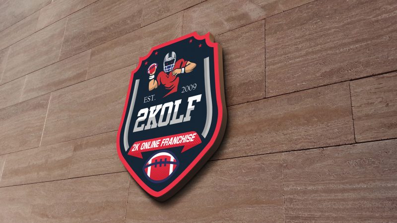
Celebrating our soon to be 10th anniversary, 2K Online Franchise has created a new logo that builds upon the foundation of its previous one. The four stars are brought together to depict the four different divisions in each conference and represent the four league administrators. On the side of the shield we have two grey bars representing field goal posts. Then at the center we have our “mascot” with lurking red eyes getting ready to make his move and to the sides of him we have our established year 2009, followed by our league abbreviation 2K OLF below. Rounding out the bottom is our full name inside a title banner, followed by the cornerstone of the sport, a football.
We hope you like the logo as much as we do.

Looks great! Great work on everything.
Came out even better than I expected.
The Design look great! Good logo!
The logo is much better!! I like it! Still can’t believe that the league has been running as long as it has. Good job Mijo
I really like the logo. To be honest, it looks pretty iconic.